
Friday, 31 July 2020
Tuesday, 14 July 2020
Visual Analysis of N64-era Zelda Games #1 (Models)
This post is to explore what the models and assets of the N64 era games look like and to discuss how to achieve this.
Straightaway the most obvious comparison to do is Link the protagonist.

On the left is Link from the Nintendo 64, he is made up of 696 polygons. The right is Link from the GameCube, this one is made up of nearly 3000 polygons, a 4 times increase in geometry.
The same can be seen for most 3D assets between the games. The most obvious being the main characters as they have more polygons reserved.
Other objects such as foliage and mundane items all have as few polygons as possible. This is because at the time hardware restrictions were a lot more important, the N64 just was not powerful enough to have soo many detailed models on screen.
To achieve the same quality will require a mix of two methods, one is a quicker automated way but will more than likely produce some unfavourable results. The second would be to manually edit original Windwaker models to reduce their poly counts to appropriate counts.

As you can see the polygon count is severely reduced. If you look closely at the lines around his torso, they're not even, other polygons too are now weirdly shaped. The end result in game would have undesirable shading, considering this model in its current state has less polygons that the N64 model.
Another drawback to this level of optimisation is the size of the polygons. Characters need to have enough polygons or small enough polygons to make animations look more realistic. Because of the new reduction in polygons in the above model, there is now a lot of space around Link's waist, which means if any animation shows him bending then these faces will not bend because they're too long. Instead they will bend at the end points, making him look very rigid.

If you compare this render to the previous one the difference in edges is quite clear, it looks clean and is symmetrical in most places. It even has enough polygons around his waist (as compared to method 1) to allow him to have more fluid animations.
This one was edited by hand by myself and took a few hours, simply because this is one of the most important models so extra care was taken. The overall polygon count is far less than its original 2874 on the GameCube and does now more closely follow the graphical style of the Nintendo 64. the model could be reduced further, which I may do, but for now he is much better.
I think using both methods for converting game assets will be beneficial. The optimise especially for testing, anything else such as important models I can do by hand.
Straightaway the most obvious comparison to do is Link the protagonist.

On the left is Link from the Nintendo 64, he is made up of 696 polygons. The right is Link from the GameCube, this one is made up of nearly 3000 polygons, a 4 times increase in geometry.
The same can be seen for most 3D assets between the games. The most obvious being the main characters as they have more polygons reserved.
Other objects such as foliage and mundane items all have as few polygons as possible. This is because at the time hardware restrictions were a lot more important, the N64 just was not powerful enough to have soo many detailed models on screen.
To achieve the same quality will require a mix of two methods, one is a quicker automated way but will more than likely produce some unfavourable results. The second would be to manually edit original Windwaker models to reduce their poly counts to appropriate counts.
Method 1:
The first method is a simple modification that can be applied to objects in MAX to optimise them, it reduces the amount of faces in an attempt to optimise them. But does have unfavourable results, especially for detailed models.
As you can see the polygon count is severely reduced. If you look closely at the lines around his torso, they're not even, other polygons too are now weirdly shaped. The end result in game would have undesirable shading, considering this model in its current state has less polygons that the N64 model.
Another drawback to this level of optimisation is the size of the polygons. Characters need to have enough polygons or small enough polygons to make animations look more realistic. Because of the new reduction in polygons in the above model, there is now a lot of space around Link's waist, which means if any animation shows him bending then these faces will not bend because they're too long. Instead they will bend at the end points, making him look very rigid.
Method 2:
The other way of reducing polygon counts is to do it manually. It's much more tedious but by doing so allows me to recreate and move lines in a more natural way.
If you compare this render to the previous one the difference in edges is quite clear, it looks clean and is symmetrical in most places. It even has enough polygons around his waist (as compared to method 1) to allow him to have more fluid animations.
This one was edited by hand by myself and took a few hours, simply because this is one of the most important models so extra care was taken. The overall polygon count is far less than its original 2874 on the GameCube and does now more closely follow the graphical style of the Nintendo 64. the model could be reduced further, which I may do, but for now he is much better.
I think using both methods for converting game assets will be beneficial. The optimise especially for testing, anything else such as important models I can do by hand.
Wednesday, 8 July 2020
A Visual Analysis of 90's Gaming
Whilst doing research for my project I have been focusing on visuals aesthetics, this is because I'm attempting to create a demake and the visuals are a very important factor.
During the 90's there were a lot of different consoles, arguably the two main ones were the Sony PlayStation (PS1) and the Nintendo 64 (N64). There are more consoles in this generation such as the Sega Saturn & Dreamcast, but for the sake of this project emphasis will be on the PS1 / N64.
Both consoles had the same / similar titles available, but due to hardware differences the quality of each would differ. Usually a player can identify which is which due to unique differences.
The most notable being the PS1's ‘jittering’ aka vertex snapping. This phenomenon is when idle characters and objects appear as if they are moving ever so slightly despite being completely static.
This is due to the lack of hardware in the system as it uses fixed point integers, instead of floating point values. The reason this has such a big impact is because integers are whole values i.e. 0, 1, 2, 3 etc, so when a vertex has moved enough it will snap into the next available pixel on the screen.
Unlike the N64 which uses floating point values, meaning values such as 0.1 - 0.9 and 1.0 to 1.9 and so on etc, so there is a lot more room for any vertex to move, meaning doesn’t have to snap to the nearest pixel when it reaches the next whole number.
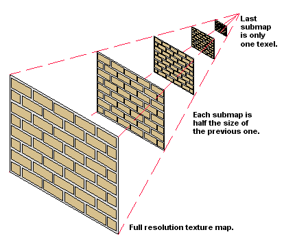
Another aspect to look at was the way each system approaches texturing. The PS1 does not use mip-mapping (a process to reduced texture sizing over distance to improve performance), whereas the N64 does.
Yet another aspect is how the PS1 renders textures. Most PS1 games can be seen to have a ‘wavy’-like effect on most of its textures. This is due to the consoles lack of z-buffer (which calculates depth), and the method of texturing. the PS1 uses something called affine texturing, which does not take into consideration camera perspective. So objects with larger surfaces such as walls and floors can sometimes appear wavy, sometimes objects were subdivided more to give them more polygons reducing the distance between points to make the effect less noticeable, but this would then have an impact on performance.
The N64 on the other hand does have a z-buffer, as such does not have this 'wavy-like' issue. The console is usually only criticised for is lack of texture quality due to mipmaps mentioned previously.
Other aspects of each system to consider are resolution, but this is usually game dependant as each console is capable of outputting up to 480i.

As you can see, the effects of each console’s hardware can be seen on each side of this image. The N64 having smooth yet blurry visuals and the PS1 sharp and ‘wavy’-like.
After digging in and evaluating each system, it has become clear that each of these systems are unique in the way they present their games. Not massively, but enough to be distinguishable, as such I will take steps to ensure the level of visual fidelity I require will be matched.
Because I am demaking a N64 title, there is not as much to be wary about. I think the most important thing to consider will be texture resolution and use of mipmaps and just general low-poly 3D assets.
During the 90's there were a lot of different consoles, arguably the two main ones were the Sony PlayStation (PS1) and the Nintendo 64 (N64). There are more consoles in this generation such as the Sega Saturn & Dreamcast, but for the sake of this project emphasis will be on the PS1 / N64.
Both consoles had the same / similar titles available, but due to hardware differences the quality of each would differ. Usually a player can identify which is which due to unique differences.
The most notable being the PS1's ‘jittering’ aka vertex snapping. This phenomenon is when idle characters and objects appear as if they are moving ever so slightly despite being completely static.
This is due to the lack of hardware in the system as it uses fixed point integers, instead of floating point values. The reason this has such a big impact is because integers are whole values i.e. 0, 1, 2, 3 etc, so when a vertex has moved enough it will snap into the next available pixel on the screen.
Unlike the N64 which uses floating point values, meaning values such as 0.1 - 0.9 and 1.0 to 1.9 and so on etc, so there is a lot more room for any vertex to move, meaning doesn’t have to snap to the nearest pixel when it reaches the next whole number.
Another aspect to look at was the way each system approaches texturing. The PS1 does not use mip-mapping (a process to reduced texture sizing over distance to improve performance), whereas the N64 does.

Yet another aspect is how the PS1 renders textures. Most PS1 games can be seen to have a ‘wavy’-like effect on most of its textures. This is due to the consoles lack of z-buffer (which calculates depth), and the method of texturing. the PS1 uses something called affine texturing, which does not take into consideration camera perspective. So objects with larger surfaces such as walls and floors can sometimes appear wavy, sometimes objects were subdivided more to give them more polygons reducing the distance between points to make the effect less noticeable, but this would then have an impact on performance.
The N64 on the other hand does have a z-buffer, as such does not have this 'wavy-like' issue. The console is usually only criticised for is lack of texture quality due to mipmaps mentioned previously.
Other aspects of each system to consider are resolution, but this is usually game dependant as each console is capable of outputting up to 480i.

As you can see, the effects of each console’s hardware can be seen on each side of this image. The N64 having smooth yet blurry visuals and the PS1 sharp and ‘wavy’-like.
How does this affect my Project?
After digging in and evaluating each system, it has become clear that each of these systems are unique in the way they present their games. Not massively, but enough to be distinguishable, as such I will take steps to ensure the level of visual fidelity I require will be matched.
Because I am demaking a N64 title, there is not as much to be wary about. I think the most important thing to consider will be texture resolution and use of mipmaps and just general low-poly 3D assets.
Subscribe to:
Comments (Atom)