Wednesday, 19 August 2020

Testing Area Transitions

To add a bit more depth to the project I decided to attempt area transitions. Up till now it has just been the main island thats been playable, mostly due to testing things. So I decided to try and get indoor areas working and fluid animations / transitions between the two.

Thanks to previous work on Silent Hill, I'm doing this with cutscenes. This allows me to use animations and even add animation keyframes on top on that. So I can have Link use a door open animation, then I can add manual animation on a door object and even modify Links position to match. Here is the result so far:

In this video you can see the editor animation frames (at the botton of the screen) and then how it looks in game.

Both in and out transitions work pretty much flawlessly, I've always hated animation but I think I've managed to make my manual adjustments look right. Only thing left to do is script a global room monitor so that I can tell that to load the next scene during the cutscene to allow proper in-game area transitioning.

The logic behind this is fairly simple:

Typically you would have to have pre-set spawn locations upon entering and exiting the interiors. I got around this by creating four cutscenes, 2 for the main island and two for interiors, each an entering and exiting.

I then setup an interior to use these animations when needed and then duplicated this rom for the other interiors, so that they are pre-setup. Exiting to the island was a bit harder, upon transitioning to the island it simply checks which area was last. Depending on this, it then loads one of the duplicated cutscenes for exting a building and warps the player and door to said location.


The code isn't complex at all, its just checking the level names after a transition to the main island. If it finds an applicable clause it then loads the right cutscene, and away it goes!

Monday, 17 August 2020

Building a Project

I've finally began to put assets together properly. I've been testing things and stuff for a good month or so now. So I decided that I need to put gameplay with art and starting pulling it into one place.

In the video above you can see some basic elements working such as; ui, movement and some interactions etc.

Asset-wise everything is still from the Gamecube, just downscaled and rendered at a lower resolution to give it that old-school demake vibe. Most are just there now for testing, once I have all the mechanics working as smoothly as I'd like I will then begin to re-craete all the assets.

Progress so far is still fairly on, but seeing as I'm focusing on just this island I don't have as much to do as I've typically had on the past projects. The focus od this one is purely aesthetics and gameplay, not story.

Currently I'm working on pickable objects such as rocks and vases, after which I will tackle swimming and combat and then include the interiors of the huts.

Tuesday, 11 August 2020

Demakes / Demasters in the Industry

See the source image

Demakes are a popular theme amongst gaming enthusiasts. The act of taking a modern game and remaking it to fit an older style of gameplay turns the whole idea of remakes on to its head.

There are a lot of concepts of this online, like the many this site has gathered 20 Greatest Demakes.
Twitter even has a hashtag just for said concepts https://twitter.com/hashtag/demake.

There have even been gamejams / competitions dedicated to demakes too, resulting in some popular games in their own right. Games such as Gang Garrison 2, which is a demake of Team Fortress 2:

https://static.tvtropes.org/pmwiki/pub/images/vDbaE_4375.png


Here are a few of the demakes that can be found online:

The Last of Us:

20 Retro 'Demakes' That Totally Transform Your Favourite Video Games

Brutal Legend:

Modern Goes Old School - 16 Bits Video Game Demakes

Bioshock:

Cheezburger Image 7256800000

Plus many more!

Demakes are an emerging genre that is increasingly starting to gather mainstream attention too. There are several official games that have been released, either directly advertised as such or just as a nod to said genre:

The Mummy:

See the source image

Stranger Things:

See the source image

Just as remakes started to become mainstream, demakes are on their way too. 

Catering to the often-nostalgic visual style of a bygone generation. These types of games will steadily become more mainstream as their cost of production will be significantly lower than that of a AAA counterpart.

Other Mentions

Another demake to point out is the recently released Super Smash Bros Melee 64.
This rom hack, replaces the entire game and reintroduces assets (and new ones) from the N64.

Saturday, 1 August 2020

Visual Analysis of N64-era Zelda Games #2 (Pre-Rendering)

Following on from the previous post, this post aims to address further visual differences between the two eras of Zelda games.

Pre-Rendered Scenes.


Due to the Nintendo 64's lack of power, small scenes were pre-rendered at a higher level of visual quality than were required. These small areas would be very basic in interaction, usually just collision areas, maybe a pot or two or even a chest.
Ocarina of Time made use of this quite a lot, even in some core areas that the player would visit a multiple of times.

These scenes are made in modelling software to the highest poly count possible and then rendered out for use as a texture. The new texture is then placed in the background and any collisions are placed in the environment.
Because the scene is basically one large texture and collisions, its possible to create quite visually stunning scenes, especially considering what hardware it is running on.

Basically, the scene above without any visuals would look very similar to this:


The high quality rendered texture would be at the far back, and the red outlines act as collisions to prevent the player going off the image and breaking the illusion.

Depending on the scene however, a more advanced method would be utilised. In addition to just an over head view, sometimes and entire room will be pre-rendered from a closeup perspective.


Now instead of having just a static 2D overhead camera with limited movement, this new perspective is now a more tradition 3D / third-person camera. This means that the camera is now the pivot of this particular room, as the player moves in either direction the camera will continue to follow them providing a greater illusion of high quality 3D environment.

This method too is quite simplistic and used more often than the previous method above, it too can be used as an alternative method as it can include the same overhead view.

To achieve this more in depth 3D illusion, the game makes use of cubemaps. This is when each side of a cube is given a similar high quality pre-render and when combined creates a seamless environment.


When placed onto a cube and a camera placed in the centre, this will create the effect of a cylindrical room. As the player runs around the scene, the camera will always be able to focus on the character. Also because this cubemap has a bottom image too, an additional camera can be placed overhead and the two can be switched between in real time. Thus making it appear as if this is a very detailed environment, when in fact its simply a very basic octagonal scene, with some minor collisions for furniture.

Usage

Windwaker (WW) does not use any pre-rendered scenes of the kind because the hardware is capable at rendering much higher quality visuals and a greater amount of 3D information. So any room in WW has been created in full 3D allowing for 360 camera movement.
WW does has opportunities to incorporate this style of environment as there as numerous small rooms, especially at the beginning of the game. So, it should be possible.

Tuesday, 14 July 2020

Visual Analysis of N64-era Zelda Games #1 (Models)

This post is to explore what the models and assets of the N64 era games look like and to discuss how to achieve this.

Straightaway the most obvious comparison to do is Link the protagonist.

On the left is Link from the Nintendo 64, he is made up of 696 polygons. The right is Link from the GameCube, this one is made up of nearly 3000 polygons, a 4 times increase in geometry.

The same can be seen for most 3D assets between the games. The most obvious being the main characters as they have more polygons reserved.
Other objects such as foliage and mundane items all have as few polygons as possible. This is because at the time hardware restrictions were a lot more important, the N64 just was not powerful enough to have soo many detailed models on screen.

To achieve the same quality will require a mix of two methods, one is a quicker automated way but will more than likely produce some unfavourable results. The second would be to manually edit original Windwaker models to reduce their poly counts to appropriate counts.


Method 1:

The first method is a simple modification that can be applied to objects in MAX to optimise them, it reduces the amount of faces in an attempt to optimise them. But does have unfavourable results, especially for detailed models.


As you can see the polygon count is severely reduced. If you look closely at the lines around his torso, they're not even, other polygons too are now weirdly shaped. The end result in game would have undesirable shading, considering this model in its current state has less polygons that the N64 model.
Another drawback to this level of optimisation is the size of the polygons. Characters need to have enough polygons or small enough polygons to make animations look more realistic. Because of the new reduction in polygons in the above model, there is now a lot of space around Link's waist, which means if any animation shows him bending then these faces will not bend because they're too long. Instead they will bend at the end points, making him look very rigid.


Method 2:

The other way of reducing polygon counts is to do it manually. It's much more tedious but by doing so allows me to recreate and move lines in a more natural way.


If you compare this render to the previous one the difference in edges is quite clear, it looks clean and is symmetrical in most places. It even has enough polygons around his waist (as compared to method 1) to allow him to have more fluid animations.
This one was edited by hand by myself and took a few hours, simply because this is one of the most important models so extra care was taken. The overall polygon count is far less than its original 2874 on the GameCube and does now more closely follow the graphical style of the Nintendo 64. the model could be reduced further, which I may do, but for now he is much better.

I think using both methods for converting game assets will be beneficial. The optimise especially for testing, anything else such as important models I can do by hand.

Wednesday, 8 July 2020

A Visual Analysis of 90's Gaming

Whilst doing research for my project I have been focusing on visuals aesthetics, this is because I'm attempting to create a demake and the visuals are a very important factor.

During the 90's there were a lot of different consoles, arguably the two main ones were the Sony PlayStation (PS1) and the Nintendo 64 (N64). There are more consoles in this generation such as the Sega Saturn & Dreamcast, but for the sake of this project emphasis will be on the PS1 / N64.

Both consoles had the same / similar titles available, but due to hardware differences the quality of each would differ. Usually a player can identify which is which due to unique differences.

The most notable being the PS1's ‘jittering’ aka vertex snapping. This phenomenon is when idle characters and objects appear as if they are moving ever so slightly despite being completely static.


This is due to the lack of hardware in the system as it uses fixed point integers, instead of floating point values. The reason this has such a big impact is because integers are whole values i.e. 0, 1, 2, 3 etc, so when a vertex has moved enough it will snap into the next available pixel on the screen.
Unlike the N64 which uses floating point values, meaning values such as 0.1 - 0.9 and 1.0 to 1.9 and so on etc, so there is a lot more room for any vertex to move, meaning doesn’t have to snap to the nearest pixel when it reaches the next whole number.

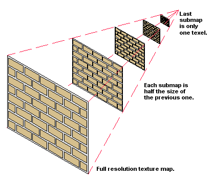
Another aspect to look at was the way each system approaches texturing. The PS1 does not use mip-mapping (a process to reduced texture sizing over distance to improve performance), whereas the N64 does.


Yet another aspect is how the PS1 renders textures. Most PS1 games can be seen to have a ‘wavy’-like effect on most of its textures. This is due to the consoles lack of z-buffer (which calculates depth), and the method of texturing. the PS1 uses something called affine texturing, which does not take into consideration camera perspective. So objects with larger surfaces such as walls and floors can sometimes appear wavy, sometimes objects were subdivided more to give them more polygons reducing the distance between points to make the effect less noticeable, but this would then have an impact on performance.
The N64 on the other hand does have a z-buffer, as such does not have this 'wavy-like' issue. The console is usually only criticised for is lack of texture quality due to mipmaps mentioned previously.
Other aspects of each system to consider are resolution, but this is usually game dependant as each console is capable of outputting up to 480i.


As you can see, the effects of each console’s hardware can be seen on each side of this image. The N64 having smooth yet blurry visuals and the PS1 sharp and ‘wavy’-like.


How does this affect my Project?


After digging in and evaluating each system, it has become clear that each of these systems are unique in the way they present their games. Not massively, but enough to be distinguishable, as such I will take steps to ensure the level of visual fidelity I require will be matched.

Because I am demaking a N64 title, there is not as much to be wary about. I think the most important thing to consider will be texture resolution and use of mipmaps and just general low-poly 3D assets.